
Brand Identity, Naming, Packaging, Signage
Specialty coffee is Coffee Collective Roasters’s focal point. They wanted a simplified name while retaining ‘Roasters.’ Their regulars know them as Collective. CCR was too similar-sounding to another local coffee spot.
‘CC:Roasters’ gives flexibility to incorporate future entities.
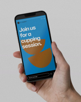
Abstract cup shapes serve as a unifying graphic element: a nod to the craft of coffee cupping.
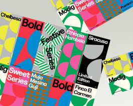
Just like their varietal coffee beans, the stickers for coffee bags are each unique.
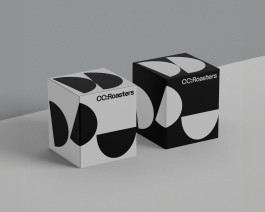
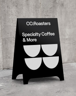
The drip bag boxes can stack together, forming a series of dynamic compositions of the secondary graphic. Coated with blackboard paint, the sign can also be used for announcements.

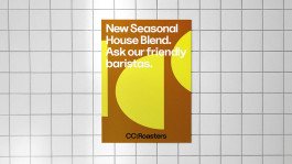
Specialty coffee is Coffee Collective Roasters’s focal point. They wanted a simplified name while retaining ‘Roasters.’ Their regulars know them as Collective. CCR was too similar-sounding to another local coffee spot.
#Visual Identity #Visual Communication #Packaging #Signage

‘CC:Roasters’ gives flexibility to incorporate future entities.


The drip bag boxes can stack together, forming a series of dynamic compositions of the secondary graphic. Coated with blackboard paint, the sign can also be used for announcements.

Hi! Melissa Chan is a human person/ graphic designer ☻
Working primarily on visual identities and typographic-led graphic communication.
Based in UA, by way of NL and MY.
Received her BDes from the Royal Academy of Art, The Hague in 2015.
Open to working together ↪ m[at]melissachan.nl
Connect ↪ linkedin, ig
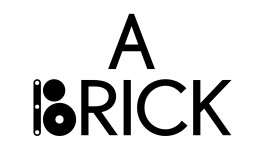
A Brick a Day
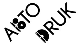
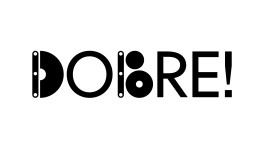
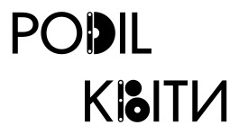
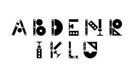
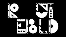
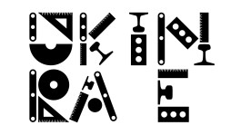
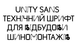
Unity Sans was created to support Ukraine in rebuilding its economy and fostering new businesses. Designed specifically for the “We Build Ukraine” project, this typeface serves as a symbolic contribution to the nation’s reconstruction efforts.

about
work
play
about