Occasional Typo
visual communication,
writing
self-initiated
role:
art direction
design
Occasional Typo was born as a side project: a playground for graphic poster ‘workouts.’ Here are a few selected ones:


⌃ Growing up multi-lingual, and amidst a backdrop of Letrasets, Multiset is a series highlighting Melissa’s language skills.


⌃ From left to right: Orange Peel, Purple Rain, Cherry on Top


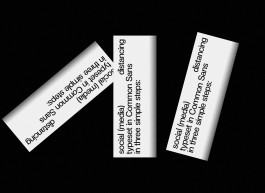
⌃ A few posters made during COVID-19 lockdown on social distancing.


⌃ Vernacular Ukranianian signs, and a (post)er inspired by Dutch graphic (post)al stamps.
Occasional Typo
visual communication,
writing
self-initiated
role:
art direction
design
Occasional Typo was born as a side project: a playground for graphic poster ‘workouts.’ Here are a few selected ones:


⌃ Growing up multi-lingual, and amidst a backdrop of Letrasets, Multiset is a series highlighting Melissa’s language skills.


⌃ From top to bottom: Orange Peel, Purple Rain, Cherry on Top


⌃ A few posters made during COVID-19 lockdown on social distancing.


⌃ Vernacular Ukranianian signs, and a (post)er inspired by Dutch graphic (post)al stamps.

