Art Direction, Curation, Writing, Video, Exhibition Design, Print
⧗ Year: 2015
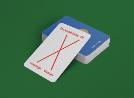
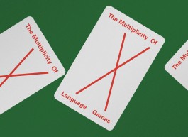
⬑ WORD PLAYS — THE MULTIPLICITY OF LANGUAGE GAMES
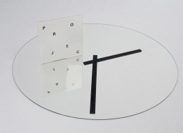
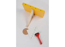
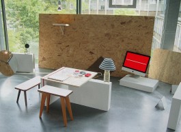
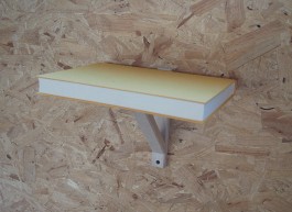
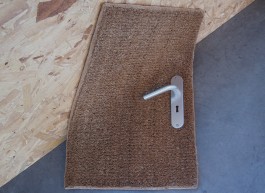
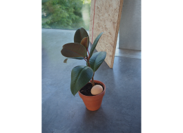
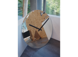
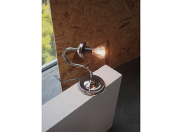
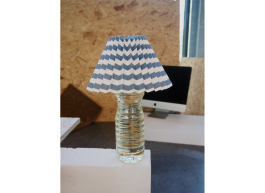
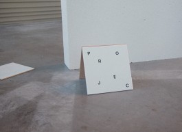
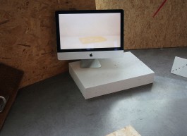
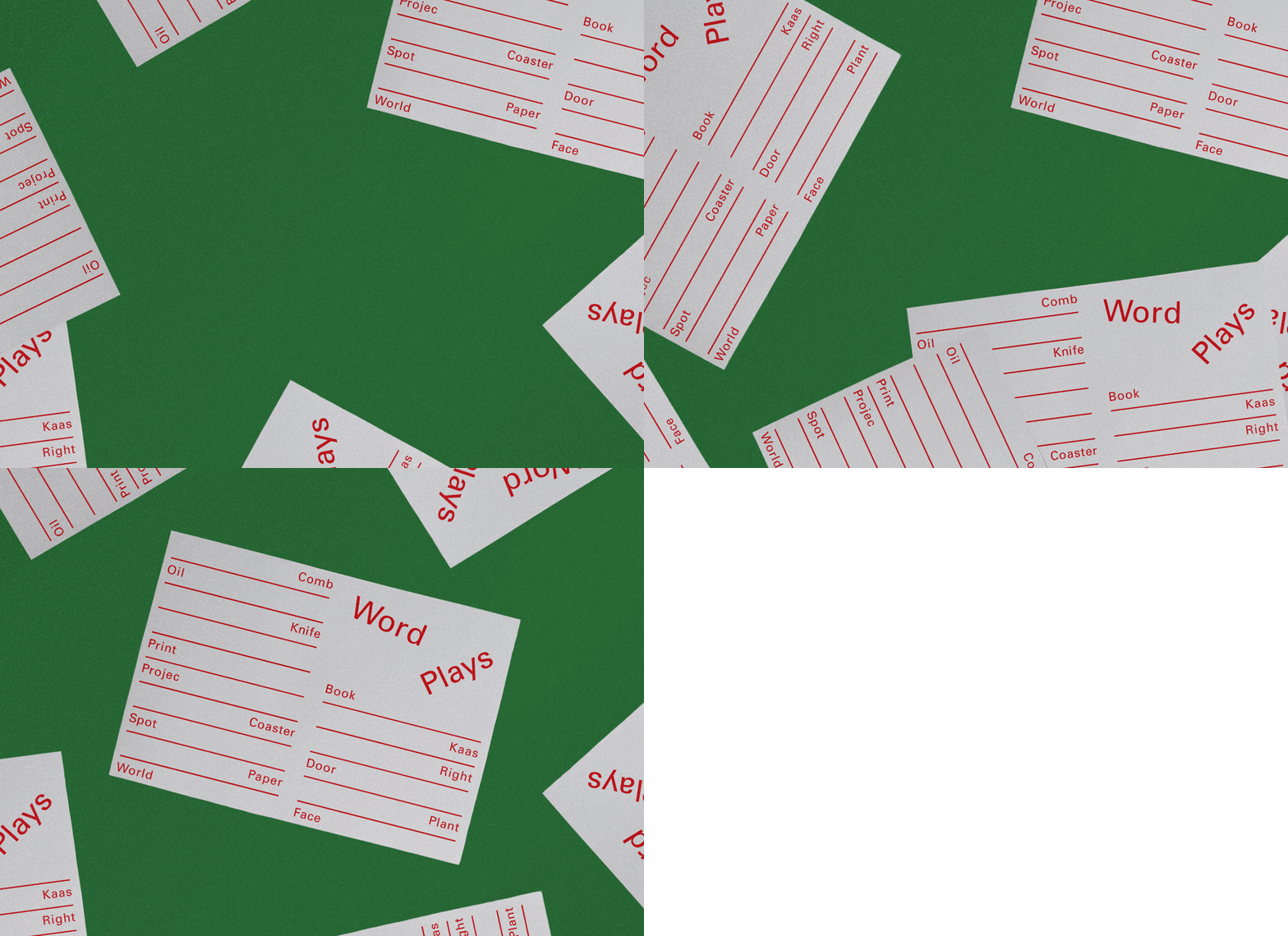
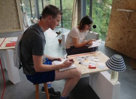
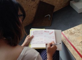
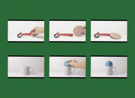
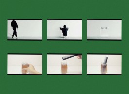
My Bachelor’s project is an attempt at the following scenarios: How can type, objects and spaces become actors, stages and narrators? What happens when ordinary word meanings are deconstructed, and recontextualised?
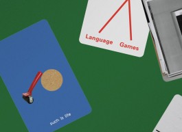
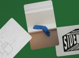
Elementary everyday objects are cast as actors, paying homage to Ludwig Wittgenstein’s thoughts on ‘the multiplicity of language-games’: ‘Making up a story and reading it,’ ‘Play- acting,’ and ‘Making a joke and telling it.’ These acts explore the translations of type, objects and spaces into new forms of meanings by disrupting the order of things, breaking the meaning, and turning things upside down.
This project is motivated by the urge for individual freedom, independent thinking and individual consciousness. To attain them, it is imperative to challenge the existing state of affairs. In addition, graphic design is more than an act of crafting a visual language. Words and language can play essential roles in visual communication. They open up the possibilities for generating different meanings and viewpoints: sometimes we need to dismantle fixed definitions in order to see things in new perspectives.
Under guidance of: Michel Hoogervorst, Matthias Kreutzer, Dirk Vis, Frits Deys, Roosje Klap, Niels Schrader, Luna Maurer + Roel Wouters ● During time at: Royal Academy of Art, The Hague
Visual Poetry, Self-initiated
⧗ Year: 2017
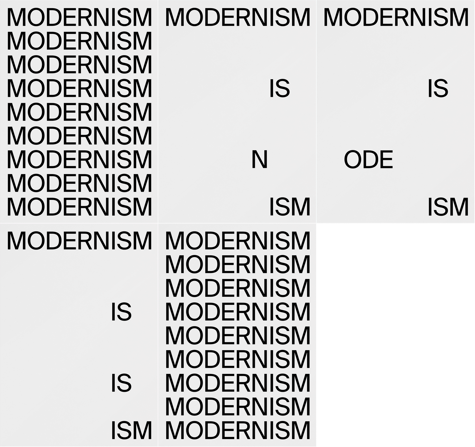
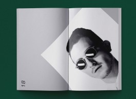
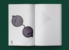
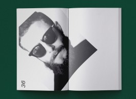
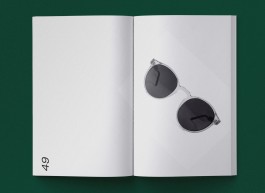
⬑ WHAT IS MODERN—ISM?
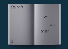
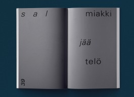
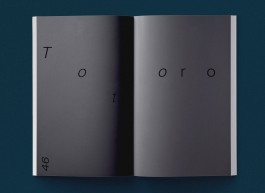
A typographic modernist poem.
Art Direction, Writing, Print, Editorial, Book Design
⧗ Year: 2014
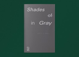
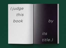
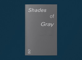
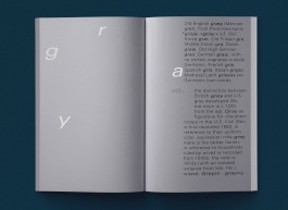
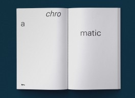
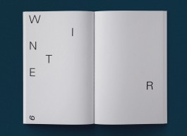
⬑ 50 SHADES OF / IN GRAY
What happens when you literally judge books by their covers and titles? As part of an assignment for Image class, I explored my interest in Text as Image.
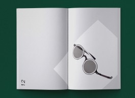
With tongue in cheek humour, I made two books after E.L. James’s 50 Shades of Gray. One book explores words associated with the word gray, while the other one is literally 50 shades in gray.
Under guidance of: Michel Hoogervorst ● During time at: Royal Academy of Art, The Hague
Poster, Print
⧗ Year: 2020
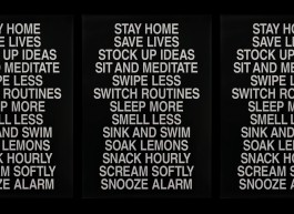
⬑ STAY HOME IDEAS
A poster I submitted to the #StaySaneStaySane poster initiative.



Research, Writing, Print, Editorial, Book Design, Coding, Web
⧗ Year: 2014/15
⬑ READ BETWEEN THESE LINES
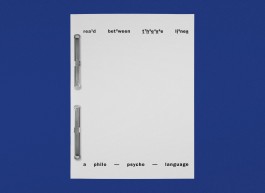
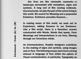
Can the Language arising from Text-only graphics Form Visual Interpretations and influence our Existential state of Consciousness?
My Bachelor’s thesis is an exploration on shaping Dialogues to spur the ‘Form–agination’ in the mind of the Reader, by making meaningful letterforms (Typography) using Words and Language.
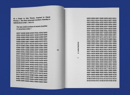
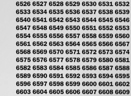
I was short of some few thousand words for my thesis. During my research, I had come across Claude Closky’s The First Thousand Numbers Classified in Alphabetical Order . It gave me an idea for a solution; following Closky’s artwork, I inserted ‘the last 1152 of words in numerical order’ as a finale and concluded my thesis with approximately 7,500 words.
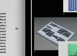
We were also required to accompany the print version of our theses with a digital version. The print version is exported and uploaded as SVG format. Adding to the existential theme, there is a date and timestamp, along with a print button. When the digital version is printed from the browser, the timestamp gets immortalised onto the hard copy.
Read the online version here.
Under guidance of: Marjan Brandsma, Dirk Vis + Eric Schrijver ● During time at: Royal Academy of Art, The Hague
Art Direction, Video, Self-initiated
⧗ Year: 2018
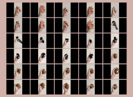
⬑ AN OPEN CASTING FOR A STRESS BALL
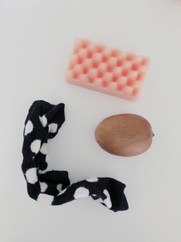
Using everyday objects/food I found around the apartment, I auditioned them for the role as a stress ball.
VIEW VIDEO #1
VIEW VIDEO #2
VIEW VIDEO #3

Coding, Web
⧗ Year: 2014
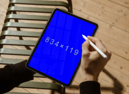
⬑ AutOmmatiK [After On Kawara]
I broke the taboo of copying the work of an artist I feel jealous about not having made, and re-appropriated into digital form.
I ‘copied’ On Kawara and his series of Date Paintings—into a website which automatically displays the devices’ screen sizes, emulating his process of “inscribing the exact date he created the painting.”
View the website here.
Under guidance of: Dirk Vis ● During time at: Royal Academy of Art, The Hague
Art Direction, Video, Self-initiated
⧗ Year: 2016
⬑ HOW TO FILTER AN ONLINE SEARCH
I made a short tutorial on how to filter an online search.
Art Direction, Writing, Print, Editorial, Book Design
⧗ Year: 2014
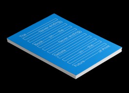
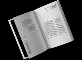
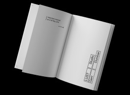
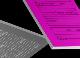
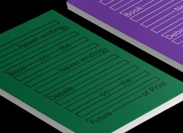
⬑ THE NEVER-ENDING BOOK ON THE NEVER-ENDING DEBATE ON THE FUTURE OF PRINT
What is the Book of Tomorrow? It all started with this question, which is not dissimilar to the question of Is Print Dead? Most are familiar with the infamous proclamation that Print is Dead, especially amongst graphic designers. This never-ending statement is also a debatable one, and often repeated; it has become rather threadbare. This led to an idea that Love is (also) Dead, another debatable statement, but an interesting parallel as we now live in the modern digital versus traditional notions and ideas age.
Print is Dead vs Love is Dead: what would come out of this research? My initial idea was to interview Dutch graphic designers Experimental Jetset and conditional designer Roel Wouters (both work in the same field, but opposites in terms of medium) with a set of 18 questions on Print and Love. Both parties had very kindly replied they would like to take part, but due to their busy schedules, unable to do so within the timeframe given.
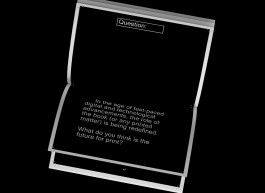
Would they then be able to answer just one question: What is the future for print? I also emailed the same question out to a handful of graphic designers, studios and writers. No replies filled my inbox (of course, hardly surprising as I totally understand their hectic schedules). Thus, I was left with a never-ending topic—which after some accidental research, I found was often asked of most graphic designers and writers—and with no answers.
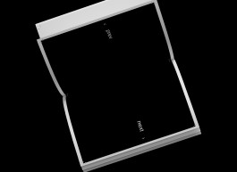
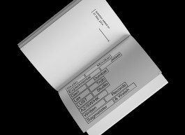
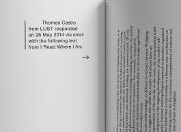
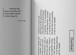
And so the never-ending book came to be the central idea for my (experimental) research of the ‘book’. This never-ending book is updatable: as I gradually receive answers in the future, they will be added in. Aside from the topic of the question, the book is also interspersed with various sources of relevant information pertaining to books and the topic of print. They could be articles from another book, or other types of sources.
This act of scrapbooking is similar to the current state of dissemination of digital information online. By taking and breaking apart the usual form of a book—in this case the situation disrupts the traditional book structure—it prompts the following questions:
1. What is a book?
2. What shapes a book?
3. Is the current structure of a book still relevant?
Under guidance of: Adriaan Mellegers ● During time at: Royal Academy of Art, The Hague
Self-initiated
⧗ Year: 2019
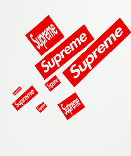
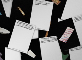
⬑ SUPREMETIST COMPOSITION (WITH EIGHT RED SUPREME LOGOS)
A supreme tribute to Kazimir Malevich’s painting.

Art Direction, Writing, Print, Editorial, Book Design
⧗ Year: 2014
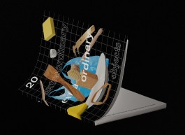
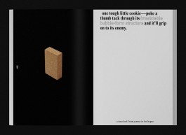
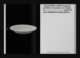
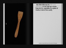
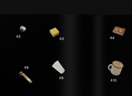
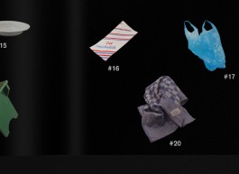
⬑ 20 EXTRAORDINARY EXTRA ORDINARY OBJECTS
We were given a brief to create a top 20 about something we’re interested in, and design it in an appropriate way. Using language and humour, I created a list of ordinary objects and compiled them into short stories.
Often times, we overlook the small things in life and take them for granted. In our every day 24-hour working economy, we tend to forget to stop and look at things around us and admire the qualities in ordinary objects.
We tend to buy objects based mostly on their functionality. What if an object is more than just a static thing that sits on shelves? Can they be extraordinary, or are they just plain extra ordinary?
Under guidance of: Esther de Vries ● During time at: Royal Academy of Art, The Hague
↑


⬑ WORD PLAYS — THE MULTIPLICITY OF LANGUAGE GAMES
My Bachelor’s project is an attempt at the following scenarios: How can type, objects and spaces become actors, stages and narrators? What happens when ordinary word meanings are deconstructed, and recontextualised?
Elementary everyday objects are cast as actors, paying homage to Ludwig Wittgenstein’s thoughts on ‘the multiplicity of language-games’: ‘Making up a story and reading it,’ ‘Play- acting,’ and ‘Making a joke and telling it.’ These acts explore the translations of type, objects and spaces into new forms of meanings by disrupting the order of things, breaking the meaning, and turning things upside down.
This project is motivated by the urge for individual freedom, independent thinking and individual consciousness. To attain them, it is imperative to challenge the existing state of affairs. In addition, graphic design is more than an act of crafting a visual language. Words and language can play essential roles in visual communication. They open up the possibilities for generating different meanings and viewpoints: sometimes we need to dismantle fixed definitions in order to see things in new perspectives.
Under guidance of: Michel Hoogervorst, Matthias Kreutzer, Dirk Vis, Frits Deys, Roosje Klap, Niels Schrader, Luna Maurer + Roel Wouters ● During time at: Royal Academy of Art, The Hague
Art Direction, Curation, Writing, Video, Exhibition Design, Print
⧗ Year: 2015

⬑ WHAT IS MODERN—ISM?
A typographic modernist poem.
Visual Poetry, Self-initiated
⧗ Year: 2017


⬑ 50 SHADES OF / IN GRAY
What happens when you literally judge books by their covers and titles? As part of an assignment for Image class, I explored my interest in Text as Image.
With tongue in cheek humour, I made two books after E.L. James’s 50 Shades of Gray. One book explores words associated with the word gray, while the other one is literally 50 shades in gray.
Under guidance of: Michel Hoogervorst ● During time at: Royal Academy of Art, The Hague
Art Direction, Writing, Print, Editorial, Book Design
⧗ Year: 2014

⬑ STAY HOME IDEAS
A poster I submitted to the #StaySaneStaySane poster initiative.
Poster, Print
⧗ Year: 2020


⬑ READ BETWEEN THESE LINES
Can the Language arising from Text-only graphics Form Visual Interpretations and influence our Existential state of Consciousness?
My Bachelor’s thesis is an exploration on shaping Dialogues to spur the ‘Form–agination’ in the mind of the Reader, by making meaningful letterforms (Typography) using Words and Language.
I was short of some few thousand words for my thesis. During my research, I had come across Claude Closky’s The First Thousand Numbers Classified in Alphabetical Order . It gave me an idea for a solution; following Closky’s artwork, I inserted ‘the last 1152 of words in numerical order’ as a finale and concluded my thesis with approximately 7,500 words.
We were also required to accompany the print version of our theses with a digital version. The print version is exported and uploaded as SVG format. Adding to the existential theme, there is a date and timestamp, along with a print button. When the digital version is printed from the browser, the timestamp gets immortalised onto the hard copy.
Read the online version here.
Under guidance of: Marjan Brandsma, Dirk Vis + Eric Schrijver ● During time at: Royal Academy of Art, The Hague
Research, Writing, Print, Editorial, Book Design, Coding, Web
⧗ Year: 2014/15


⬑ AN OPEN CASTING FOR A STRESS BALL
Using everyday objects/food I found around the apartment, I auditioned them for the role as a stress ball.
VIEW VIDEO #1
VIEW VIDEO #2
VIEW VIDEO #3
Art Direction, Video, Self-initiated
⧗ Year: 2018


⬑ AutOmmatiK [After On Kawara]
I broke the taboo of copying the work of an artist I feel jealous about not having made, and re-appropriated into digital form.
I ‘copied’ On Kawara and his series of Date Paintings—into a website which automatically displays the devices’ screen sizes, emulating his process of “inscribing the exact date he created the painting.”
View the website here.
Under guidance of: Dirk Vis ● During time at: Royal Academy of Art, The Hague
Coding, Web
⧗ Year: 2014
⬑ HOW TO FILTER AN ONLINE SEARCH
I made a short tutorial on how to filter an online search.
Art Direction, Video, Self-initiated
⧗ Year: 2016


⬑ THE NEVER-ENDING BOOK ON THE NEVER-ENDING DEBATE ON THE FUTURE OF PRINT
What is the Book of Tomorrow? It all started with this question, which is not dissimilar to the question of Is Print Dead? Most are familiar with the infamous proclamation that Print is Dead, especially amongst graphic designers. This never-ending statement is also a debatable one, and often repeated; it has become rather threadbare. This led to an idea that Love is (also) Dead, another debatable statement, but an interesting parallel as we now live in the modern digital versus traditional notions and ideas age.
Print is Dead vs Love is Dead: what would come out of this research? My initial idea was to interview Dutch graphic designers Experimental Jetset and conditional designer Roel Wouters (both work in the same field, but opposites in terms of medium) with a set of 18 questions on Print and Love. Both parties had very kindly replied they would like to take part, but due to their busy schedules, unable to do so within the timeframe given.
Would they then be able to answer just one question: What is the future for print? I also emailed the same question out to a handful of graphic designers, studios and writers. No replies filled my inbox (of course, hardly surprising as I totally understand their hectic schedules). Thus, I was left with a never-ending topic—which after some accidental research, I found was often asked of most graphic designers and writers—and with no answers.
And so the never-ending book came to be the central idea for my (experimental) research of the ‘book’. This never-ending book is updatable: as I gradually receive answers in the future, they will be added in. Aside from the topic of the question, the book is also interspersed with various sources of relevant information pertaining to books and the topic of print. They could be articles from another book, or other types of sources.
This act of scrapbooking is similar to the current state of dissemination of digital information online. By taking and breaking apart the usual form of a book—in this case the situation disrupts the traditional book structure—it prompts the following questions:
1. What is a book?
2. What shapes a book?
3. Is the current structure of a book still relevant?
Under guidance of: Adriaan Mellegers ● During time at: Royal Academy of Art, The Hague
Art Direction, Writing, Print, Editorial, Book Design
⧗ Year: 2014

⬑ SUPREMETIST COMPOSITION (WITH EIGHT RED SUPREME LOGOS)
A supreme tribute to Kazimir Malevich’s painting.
Self-initiated
⧗ Year: 2019


⬑ 20 EXTRAORDINARY EXTRA ORDINARY OBJECTS
We were given a brief to create a top 20 about something we’re interested in, and design it in an appropriate way. Using language and humour, I created a list of ordinary objects and compiled them into short stories.
Often times, we overlook the small things in life and take them for granted. In our every day 24-hour working economy, we tend to forget to stop and look at things around us and admire the qualities in ordinary objects.
We tend to buy objects based mostly on their functionality. What if an object is more than just a static thing that sits on shelves? Can they be extraordinary, or are they just plain extra ordinary?
Under guidance of: Esther de Vries ● During time at: Royal Academy of Art, The Hague
Art Direction, Writing, Print, Editorial, Book Design
⧗ Year: 2014
↑
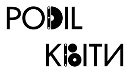
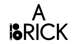
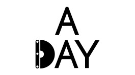
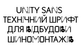
Unity Sans
graphic design
in collaboration with: Kyiv Type Foundry
year: 2023
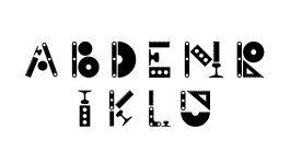
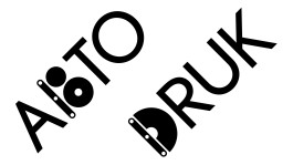
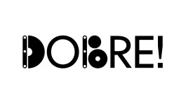
Unity Sans was created to support Ukraine in rebuilding its economy and fostering new businesses. Designed specifically for the “We Build Ukraine” project, this typeface serves as a symbolic contribution to the nation’s reconstruction efforts.


Hi! Melissa Chan is a human person/ graphic designer ☻
Working primarily on visual identities and typographic-led graphic communication.
Based in UA, by way of NL and MY.
Received her BDes from the Royal Academy of Art, The Hague in 2015.
Open to working together ↪ m[at]melissachan.nl
Connect ↪ linkedin, ig
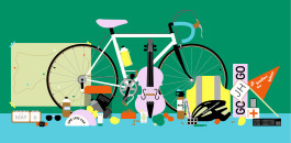
Cycling With
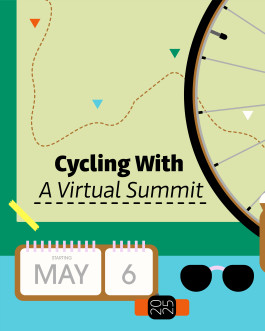
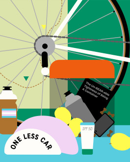
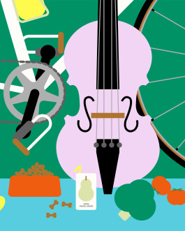
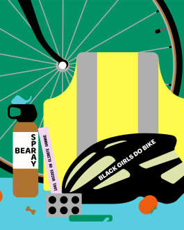
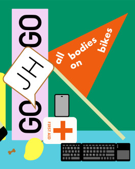
How do we present and fit all the topics of the summit celebrating women from all walks of life? Initially I illustrated the literal nouns with pictograms but it didn’t feel right. It wasn’t connecting with the story of the summit. I was stuck, and went back to the drawing board. How do I approach this from a fun angle?
Well, I love illustrating objects. The target audience are cyclists. Illustrating the essentials cyclist bring on them on the road suddenly made a lot of sense. CW added to the idea: How about including items related to each speakers?
illustration
in collaboration with: Annalisa van den Bergh
year: 2025
about
work
play
about