


A POSTERGRAPHIC TYPE
Identity, Type
An experimental lettering exercise as part of my self-initiated graphic design workouts.
It stemmed from the brief of creating a logomark for Occasional Typo. I started with a rectangular shape (denoting the silhouette of a poster) and juxtaposed it with a circle to create the letter ‘O’. I applied the same technique onto other shapes to form additional letters.
⧗ Year: 2019
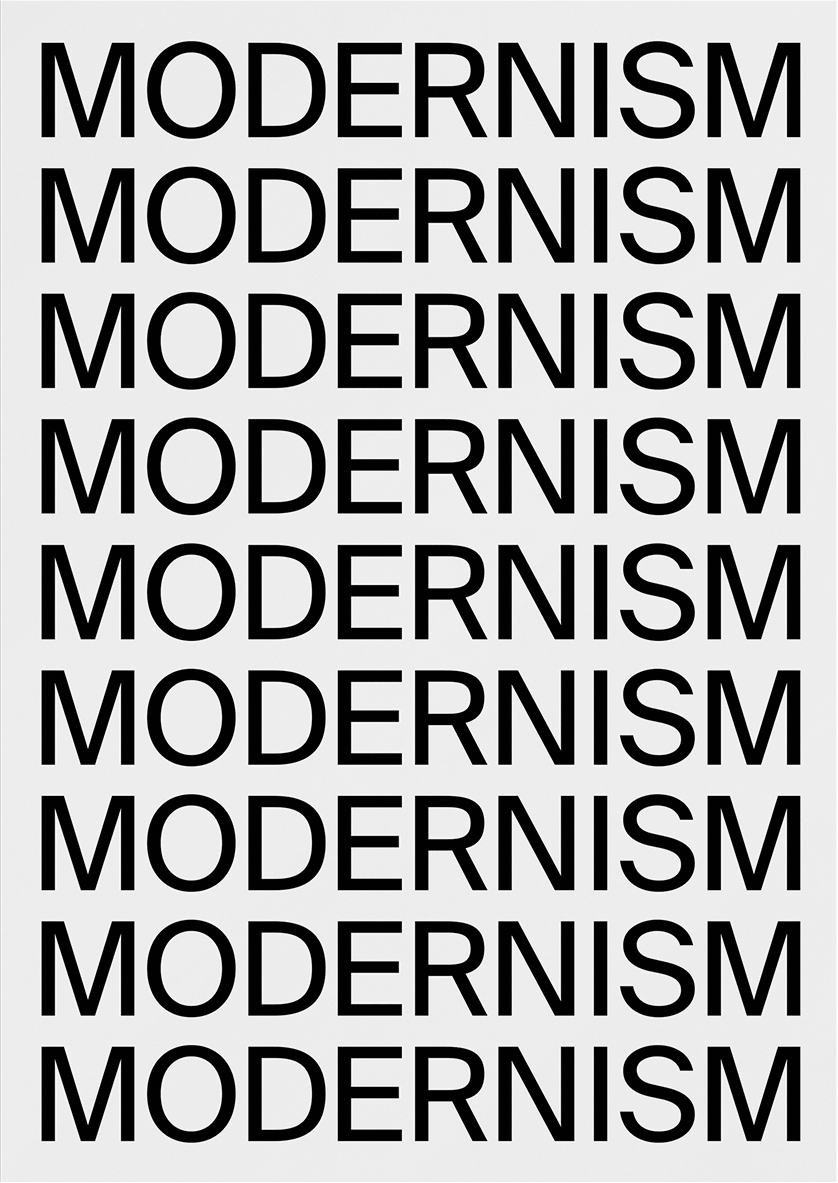
WHAT IS MODERN—ISM?
Visual Poetry, Self-initiated
A typographic modernist poem.
⧗ Year: 2017


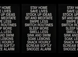
QUARANTINE PERFORMANCE #2
Poster, Print
#StaySaneStaySafe is an open call for poster designs (an initiative
by Studio Lennarts de Bruijn and Overdeschreef) aimed at spreading love and positive vibes during the COVID-19 pandemic (especially to frontline workers.)
I contributed designs to the Home-Stayers category; pictured here is one of them. Also shown are colour variations that were not submitted.
⧗ Year: 2020


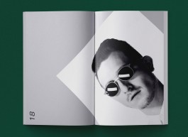
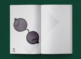
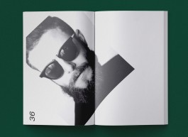
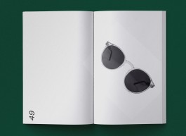
ILLUSTRATIONS
Self-initiated
(1) untitled (2) 3 vessels (4) sinaasappel (5) de peer en de fles (6) “WATCH” (7) “CREAM” (8) “LEMON AND TOMATO”
⧗ Year: 2019/20
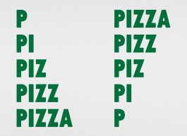


AN (ODE)NTITY TO PIZZA
Identity, Signage, Print, Environmental Graphics
A former launderette in a block of retro flats (nestled in an old cosy suburban neighbourhood in Petaling Jaya) received a second lease of life—by serving its surrounding residents delicious wood-fired pizzas. The new owners were looking for a pared-down identity with a playful vibe for their small pizzeria.
The intentional mix of two typeface styles give rise (pun intended!) to the idea of dough being knead by hand. The grill pattern, is partly inspired by 70s architecture of the flats and resembles an abstract image of ‘pizza in a box’.
⧗ Year: 2019
Client: Pizza Mansion ● Project management: Jean Cheah ● Interior design: Studios dwg. + A Three Designs ● Interior/exterior photography: Eatdrinkkl
QUARANTINE PERFORMANCE #1
Poster, Print
This is the other poster I submitted to the #StaySaneStaySane poster initiative.
⧗ Year: 2020

A FILM LIFE
Art Direction, Writing, Animation
Filmhuis Den Haag had a new identity, and sought short animations to show before movie screenings. Grrr, the agency which designed their identity, worked with the second- and third-year graphic design students at KABK on a design pitch.
Inspired by the idea of life being cinematic, like a reel of film, I proposed a ‘typographic screenplay’ which plays on the letter ‘F’ from the name Filmhuis Den Haag.
⧗ Year: 2014
Under guidance of: Pawel Pokutycki, Gijsbert Dijker + Jeroen Disch (Grrr) ● During time at: Royal Academy of Art, The Hague ● Client: Filmhuis Den Haag

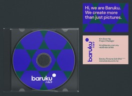
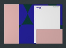


BOLD, CAMERA, ACTION!
Art Direction, Identity, Writing, Print, Web
Baruku Pictures is a Kuala Lumpur-based production house. A seasoned studio, they were looking for a fresh new, bold and striking identity.
The identity borrows from the Japanese word Baruku—which literally means ‘bulk’. The secondary graphic uses camera shutter as a starting point, sculpted into an abstract shape that embodies a heavyweight characteristic.
⧗ Year: 2019/20
Client: Baruku Pictures


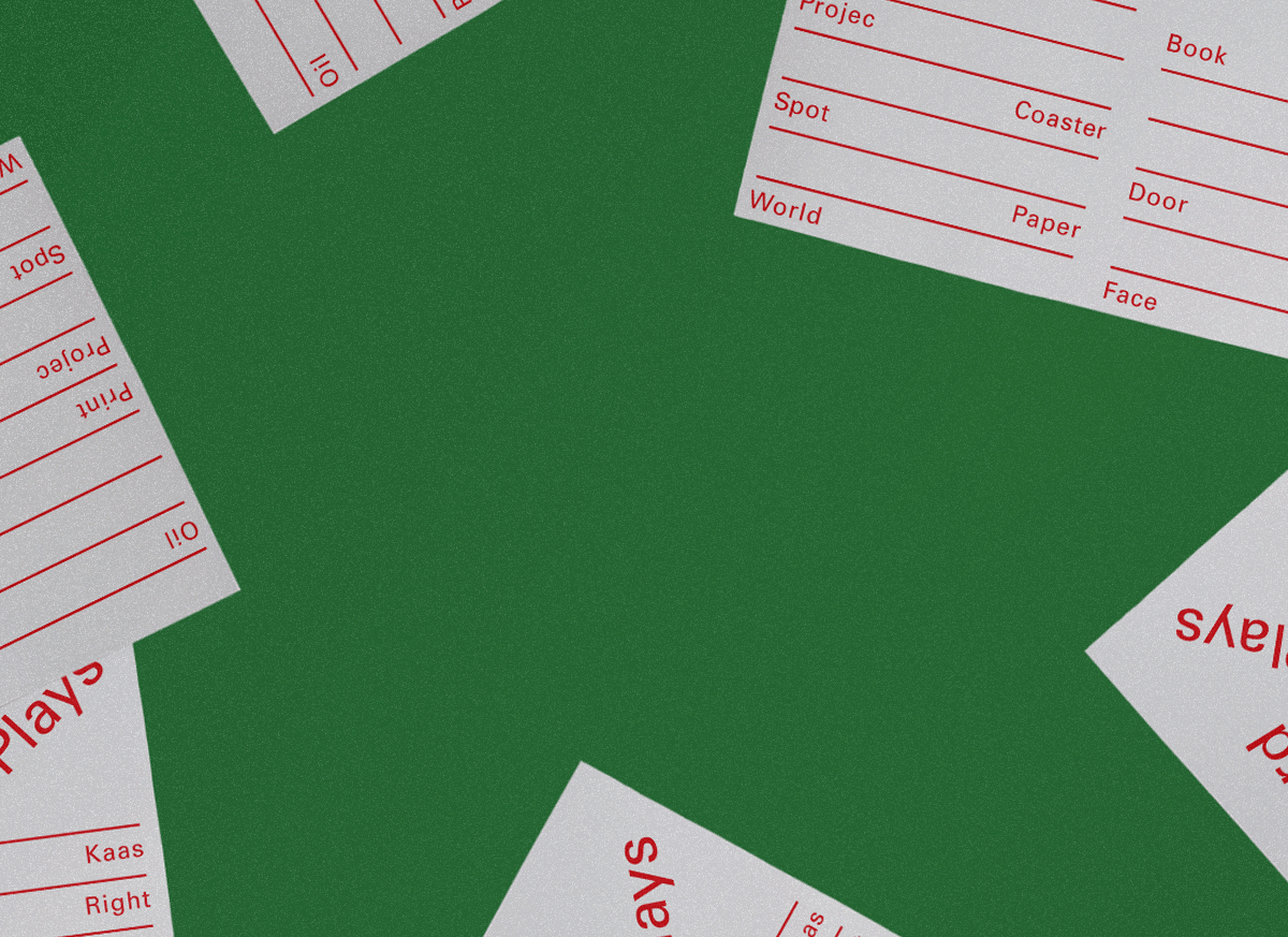
GRAPHIC DESIGN WORKOUTS
Posters, Self-initiated
I started Occasional Typo with the aim of making self-initiated posters. It is an ongoing endeavour as a way to sharpen my graphic design skills.
⧗ Year: ONGOING SINCE 2019
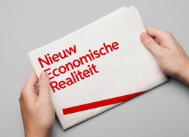


DESIGNING A NEW DUTCH ECONOMIC REALITY
Print, Editorial, Newspaper Design
As part of the third year Graphic Design department at KABK, we were given special access to the financial data for proposed governmental spendings and income for 2014 (the annual Miljoenennota) by the Dutch Ministry of Finance. Our task was to carry out extensive research, and re-contextualise the information, statistics and figures from the Miljoenennota.
My attempt was to create a new perspective on how data can be more transparent and visually engaging to the reader.
⧗ Year: 2014
Under guidance of: Niels Schrader + Lauren Alexander ● During time at: Royal Academy of Art, The Hague ● Client: Dutch Ministry of Finance ● Typeface: Husaar by Kasper Pyndt Rasmussen


IDENTITY FOR A MODERN ASIAN EATERY
Identity, Naming, Writing, Print, Illustration, Signage, Environmental Graphics, Web
Lucky Tora was a modern Asian eatery in the heart of Kuala Lumpur. They were looking for a fun and contemporary brand identity, reflecting their casual dining experience.
I came up with a custom-drawn logotype that embodies a slight nod to Japanese letters, marrying eastern- and western sensibilities, coupled with secondary graphics of a custom tora (tiger) illustration, and an assortment of abstract plates.
⧗ Year: 2018/19
Client: Tora Eats ● Interior design: Pivot Studio ● Interior photography: Eunice Martin Lim, Ruo Ling Lu
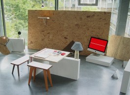
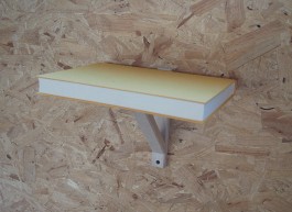
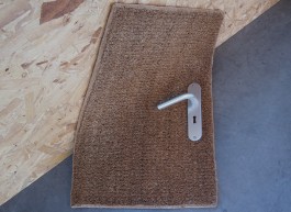
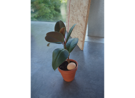


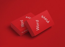
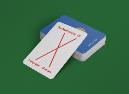
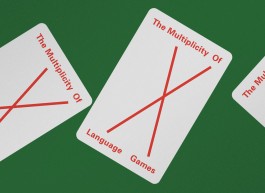
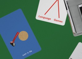
TYPE, OBJECTS AND SPACES AS ACTORS, STAGES AND NARRATORS
Art Direction, Curation, Writing, Video, Exhibition Design, Print
My Bachelor’s project is an attempt at the following scenarios: How can type, objects and spaces become actors, stages and narrators? What happens when ordinary word meanings are deconstructed, and recontextualised?
Elementary everyday objects are cast as actors, paying homage to Ludwig Wittgenstein’s thoughts on ‘the multiplicity of language-games’: ‘Making up a story and reading it,’ ‘Play- acting,’ and ‘Making a joke and telling it.’ These acts explore the translations of type, objects and spaces into new forms of meanings by disrupting the order of things, breaking the meaning, and turning things upside down.
This project is motivated by the urge for individual freedom, independent thinking and individual consciousness. To attain them, it is imperative to challenge the existing state of affairs. In addition, graphic design is more than an act of crafting a visual language. Words and language can play essential roles in visual communication. They open up the possibilities for generating different meanings and viewpoints: sometimes we need to dismantle fixed definitions in order to see things in new perspectives.
⧗ Year: 2015
Under guidance of: Michel Hoogervorst, Matthias Kreutzer, Dirk Vis, Frits Deys, Roosje Klap, Niels Schrader, Luna Maurer + Roel Wouters ● During time at: Royal Academy of Art, The Hague
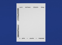


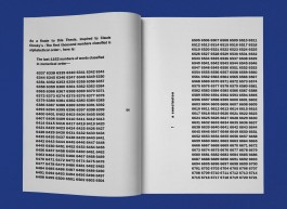

7,500 EXISTENTIAL WORDS ON TEXT AS IMAGE
Research, Writing, Print, Editorial, Book Design, Coding, Web
Can the Language arising from Text-only graphics Form Visual Interpretations and influence our Existential state of Consciousness?
My Bachelor’s thesis is an exploration on shaping Dialogues to spur the ‘Form–agination’ in the mind of the Reader, by making meaningful letterforms (Typography) using Words and Language.
I was short of some few thousand words for my thesis. During my research, I had come across Claude Closky’s The First Thousand Numbers Classified in Alphabetical Order . It gave me an idea for a solution; following Closky’s artwork, I inserted ‘the last 1152 of words in numerical order’ as a finale and concluded my thesis with approximately 7,500 words.
We were also required to accompany the print version of our theses with a digital version. The print version is exported and uploaded as SVG format. Adding to the existential theme, there is a date and timestamp, along with a print button. When the digital version is printed from the browser, the timestamp gets immortalised onto the hard copy.
⧗ Year: 2014/15
Under guidance of: Marjan Brandsma, Dirk Vis + Eric Schrijver ● During time at: Royal Academy of Art, The Hague
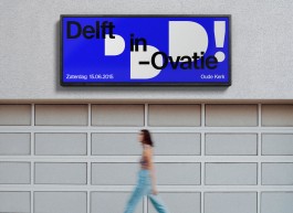


ORCHESTRATING AN APPLAUDING LOGOMARK
Identity
Delft in-Ovatie is a non-profit foundation. Their aim is to connect people and organisations in Delft to promote Delft culture in particular, with a focus on innovation and music.
Every year the foundation organises a music event in which this objective is achieved. As part of a design pitch, they were looking for a logo for the foundation.
Based on the foundation’s focus on connecting people through their music event, I proposed the idea of incorporating the act of standing ovation and applause into their logomark. Unfortunately, the design did make the cut.
⧗ Year: 2014
Under guidance of: Pawel Pokutycki + Gijsbert Dijker ● During time at: Royal Academy of Art, The Hague ● Client: Delft in-Ovatie


AutOmmatiK [After On Kawara]
Coding, Web
I broke the taboo of copying the work of an artist I feel jealous about not having made, and re-appropriated into digital form.
I ‘copied’ On Kawara and his series of Date Paintings—into a website which automatically displays the devices’ screen sizes, emulating his process of “inscribing the exact date he created the painting.”
⧗ Year: 2014
Under guidance of: Dirk Vis ● During time at: Royal Academy of Art, The Hague
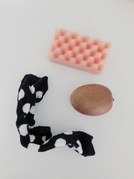
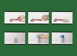
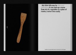
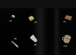
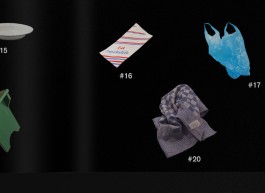
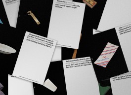
AN OPEN CASTING FOR A STRESS BALL
Art Direction, Video, Self-initiated
Using everyday objects/food I found around the apartment, I auditioned them for the role as a stress ball.
⧗ Year: 2018
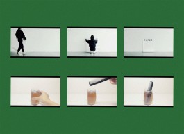
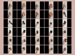
HOW TO FILTER AN ONLINE SEARCH
Art Direction, Video, Self-initiated
I made a short tutorial on how to filter an online search.
⧗ Year: 2016
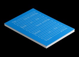
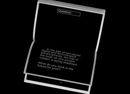
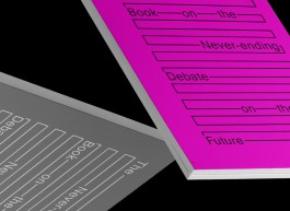
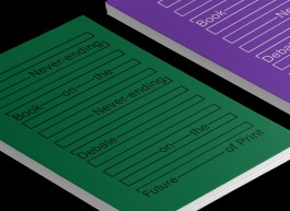
THE BOOK WITH NO CONCLUSION
Art Direction, Writing, Print, Editorial, Book Design
What is the Book of Tomorrow? It all started with this question, which is not dissimilar to the question of Is Print Dead? Most are familiar with the infamous proclamation that Print is Dead, especially amongst graphic designers. This never-ending statement is also a debatable one, and often repeated; it has become rather threadbare. This led to an idea that Love is (also) Dead, another debatable statement, but an interesting parallel as we now live in the modern digital versus traditional notions and ideas age.
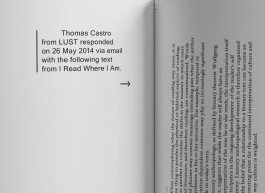
Print is Dead vs Love is Dead: what would come out of this research? My initial idea was to interview Dutch graphic designers Experimental Jetset and conditional designer Roel Wouters (both work in the same field, but opposites in terms of medium) with a set of 18 questions on Print and Love. Both parties had very kindly replied they would like to take part, but due to their busy schedules, unable to do so within the timeframe given.
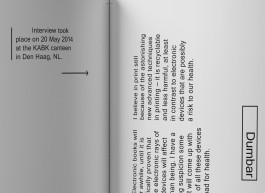
Would they then be able to answer just one question: What is the future for print? I also emailed the same question out to a handful of graphic designers, studios and writers. No replies filled my inbox (of course, hardly surprising as I totally understand their hectic schedules). Thus, I was left with a never-ending topic—which after some accidental research, I found was often asked of most graphic designers and writers—and with no answers.
And so the never-ending book came to be the central idea for my (experimental) research of the ‘book’. This never-ending book is updatable: as I gradually receive answers in the future, they will be added in. Aside from the topic of the question, the book is also interspersed with various sources of relevant information pertaining to books and the topic of print. They could be articles from another book, or other types of sources.
This act of scrapbooking is similar to the current state of dissemination of digital information online. By taking and breaking apart the usual form of a book—in this case the situation disrupts the traditional book structure—it prompts the following questions:
1. What is a book?
2. What shapes a book?
3. Is the current structure of a book still relevant?
⧗ Year: 2014
Under guidance of: Adriaan Mellegers ● During time at: Royal Academy of Art, The Hague
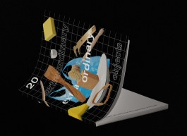

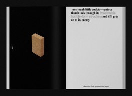
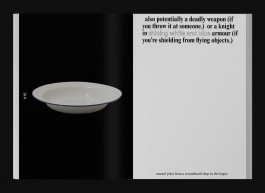
CURATING 20 EXTRAORDINARY EXTRA ORDINARY OBJECTS
Art Direction, Writing, Print, Editorial, Book Design
We were given a brief to create a top 20 about something we’re interested in, and design it in an appropriate way. Using language and humour, I created a list of ordinary objects and compiled them into short stories.
Often times, we overlook the small things in life and take them for granted. In our every day 24-hour working economy, we tend to forget to stop and look at things around us and admire the qualities in ordinary objects.
We tend to buy objects based mostly on their functionality. What if an object is more than just a static thing that sits on shelves? Can they be extraordinary, or are they just plain extra ordinary?
⧗ Year: 2014
Under guidance of: Esther de Vries ● During time at: Royal Academy of Art, The Hague
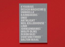
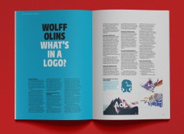


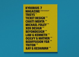

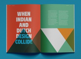


MAKING AN OBVIOUS MAGAZINE COVER
Art Direction, Print, Editorial, Magazine Design
Kyoorius Magazine was a branding, advertising, design and visual communications magazine published bi-monthly by Kyoorius; part of an initiative of Transasia Fine Papers in India. After a short hiatus from the first few issues, the magazine relaunched in 2010.
Together with Figtree Design (now Fish Do It / Some Early Birds), we revamped issues 6 and 7. With the objective to stand out from the clutter of newstands and bookshelves in mind, the idea of having a minimal layout with purely type on the cover came to form.
The beautiful Fedra Sans type family is showcased throughout—lending a bold typographic identity; a template they kept with future issues. With this formula, Kyoorius took it a step further by utilising each cover as a way to demonstrate different paper variants from Transasia Fine Paper’s collection.
⧗ Year: 2010/11
In collaboration with: Kay Khoo ● Client: Kyoorius India
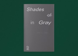
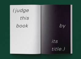
JUDGE THESE BOOKS BY THEIR COVERS
Art Direction, Writing, Print, Editorial, Book Design
What happens when you literally judge books by their covers and titles? As part of an assignment for Image class, I explored my interest in Text as Image.
With tongue in cheek humour, I made two books after E.L. James’s 50 Shades of Gray.
One book explores words associated with the word gray, while the other one is literally 50 shades in gray.
⧗ Year: 2014
Under guidance of: Michel Hoogervorst ● During time at: Royal Academy of Art, The HaguE


ARCHIVE
Identity, Print, Environmental Graphics, Curation
(1) PETRONAS Lubricants International. Identity / Print / Environmental Graphics, icw. Eric Cruz, Aaron Tan + team at Leo Burnett Kuala Lumpur, 2012. (2) GAB Foundation. Identity / Print / Environmental Graphics, icw. William Atyeo, Rupert Singleton + Aaron Tan, 2011/12. (3) District V. Identity / Print, icw. Aaron Tan, 2009. (4) Neue Format Design Mart. Identity / Curation / Design, icw. Aaron Tan + Wondermilk, 2008. (5) Kraftgrafik. Identity, icw. Aaron Tan, 2008.
A POSTERGRAPHIC TYPE
Identity, Type
An experimental lettering exercise as part of my self-initiated graphic design workouts.
It stemmed from the brief of creating a logomark for Occasional Typo. I started with a rectangular shape (denoting the silhouette of a poster) and juxtaposed it with a circle to create the letter ‘O’. I applied the same technique onto other shapes to form additional letters.
⧗ Year: 2019
WHAT IS MODERN—ISM?
Visual Poetry, Self-initiated
A typographic modernist poem.
⧗ Year: 2017
QUARANTINE PERFORMANCE #2
Poster, Print
#StaySaneStaySafe is an open call for poster designs (an initiative
by Studio Lennarts de Bruijn and Overdeschreef) aimed at spreading love and positive vibes during the COVID-19 pandemic (especially to frontline workers.)
I contributed designs to the Home-Stayers category; pictured here is one of them. Also shown are colour variations that were not submitted.
⧗ Year: 2020
ILLUSTRATIONS
Self-initiated
(1) untitled (2) 3 vessels (4) sinaasappel (5) de peer en de fles (6) “WATCH” (7) “CREAM” (8) “LEMON AND TOMATO”
⧗ Year: 2019/20
AN (ODE)NTITY TO PIZZA
Identity, Signage, Print, Environmental Graphics
A former launderette in a block of retro flats (nestled in an old cosy suburban neighbourhood in Petaling Jaya) received a second lease of life—by serving its surrounding residents delicious wood-fired pizzas. The new owners were looking for a pared-down identity with a playful vibe for their small pizzeria.
The intentional mix of two typeface styles give rise (pun intended!) to the idea of dough being knead by hand. The grill pattern, is partly inspired by 70s architecture of the flats and resembles an abstract image of ‘pizza in a box’.
⧗ Year: 2019
Client: Pizza Mansion ● Project management: Jean Cheah ● Interior design: Studios dwg. + A Three Designs ● Interior/exterior photography: Eatdrinkkl
QUARANTINE PERFORMANCE #1
Poster, Print
This is the other poster I submitted to the #StaySaneStaySane poster initiative.
⧗ Year: 2020
A FILM LIFE
Art Direction, Writing, Animation
Filmhuis Den Haag had a new identity, and sought short animations to show before movie screenings. Grrr, the agency which designed their identity, worked with the second- and third-year graphic design students at KABK on a design pitch.
Inspired by the idea of life being cinematic, like a reel of film, I proposed a ‘typographic screenplay’ which plays on the letter ‘F’ from the name Filmhuis Den Haag.
⧗ Year: 2014
Under guidance of: Pawel Pokutycki, Gijsbert Dijker + Jeroen Disch (Grrr) ● During time at: Royal Academy of Art, The Hague ● Client: Filmhuis Den Haag
BOLD, CAMERA, ACTION!
Art Direction, Identity, Writing, Print, Web
Baruku Pictures is a Kuala Lumpur-based production house. A seasoned studio, they were looking for a fresh new, bold and striking identity.
The identity borrows from the Japanese word Baruku—which literally means ‘bulk’. The secondary graphic uses camera shutter as a starting point, sculpted into an abstract shape that embodies a heavyweight characteristic.
⧗ Year: 2019/20
Client: Baruku Pictures
GRAPHIC DESIGN WORKOUTS
Posters, Self-initiated
I started Occasional Typo with the aim of making self-initiated posters. It is an ongoing endeavour as a way to sharpen my graphic design skills.
⧗ Year: ONGOING SINCE 2019
DESIGNING A NEW DUTCH ECONOMIC REALITY
Print, Editorial, Newspaper Design
As part of the third year Graphic Design department at KABK, we were given special access to the financial data for proposed governmental spendings and income for 2014 (the annual Miljoenennota) by the Dutch Ministry of Finance. Our task was to carry out extensive research, and re-contextualise the information, statistics and figures from the Miljoenennota.
My attempt was to create a new perspective on how data can be more transparent and visually engaging to the reader.
⧗ Year: 2014
Under guidance of: Niels Schrader + Lauren Alexander ● During time at: Royal Academy of Art, The Hague ● Client: Dutch Ministry of Finance ● Typeface: Husaar by Kasper Pyndt Rasmussen
IDENTITY FOR A MODERN ASIAN EATERY
Identity, Naming, Writing, Print, Illustration, Signage, Environmental Graphics, Web
Lucky Tora was a modern Asian eatery in the heart of Kuala Lumpur. They were looking for a fun and contemporary brand identity, reflecting their casual dining experience.
I came up with a custom-drawn logotype that embodies a slight nod to Japanese letters, marrying eastern- and western sensibilities, coupled with secondary graphics of a custom tora (tiger) illustration, and an assortment of abstract plates.
⧗ Year: 2018/19
Client: Tora Eats ● Interior design: Pivot Studio ● Interior photography: Eunice Martin Lim, Ruo Ling Lu
TYPE, OBJECTS AND SPACES AS ACTORS, STAGES AND NARRATORS
Art Direction, Curation, Writing, Video, Exhibition Design, Print
My Bachelor’s project is an attempt at the following scenarios: How can type, objects and spaces become actors, stages and narrators? What happens when ordinary word meanings are deconstructed, and recontextualised?
Elementary everyday objects are cast as actors, paying homage to Ludwig Wittgenstein’s thoughts on ‘the multiplicity of language-games’: ‘Making up a story and reading it,’ ‘Play- acting,’ and ‘Making a joke and telling it.’ These acts explore the translations of type, objects and spaces into new forms of meanings by disrupting the order of things, breaking the meaning, and turning things upside down.
This project is motivated by the urge for individual freedom, independent thinking and individual consciousness. To attain them, it is imperative to challenge the existing state of affairs. In addition, graphic design is more than an act of crafting a visual language. Words and language can play essential roles in visual communication. They open up the possibilities for generating different meanings and viewpoints: sometimes we need to dismantle fixed definitions in order to see things in new perspectives.
⧗ Year: 2015
Under guidance of: Michel Hoogervorst, Matthias Kreutzer, Dirk Vis, Frits Deys, Roosje Klap, Niels Schrader, Luna Maurer + Roel Wouters ● During time at: Royal Academy of Art, The Hague
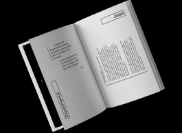
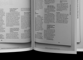
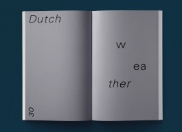
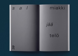
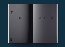
7,500 EXISTENTIAL WORDS ON TEXT AS IMAGE
Research, Writing, Print, Editorial, Book Design, Coding, Web
Can the Language arising from Text-only graphics Form Visual Interpretations and influence our Existential state of Consciousness?
My Bachelor’s thesis is an exploration on shaping Dialogues to spur the ‘Form–agination’ in the mind of the Reader, by making meaningful letterforms (Typography) using Words and Language.
I was short of some few thousand words for my thesis. During my research, I had come across Claude Closky’s The First Thousand Numbers Classified in Alphabetical Order . It gave me an idea for a solution; following Closky’s artwork, I inserted ‘the last 1152 of words in numerical order’ as a finale and concluded my thesis with approximately 7,500 words.
We were also required to accompany the print version of our theses with a digital version. The print version is exported and uploaded as SVG format. Adding to the existential theme, there is a date and timestamp, along with a print button. When the digital version is printed from the browser, the timestamp gets immortalised onto the hard copy.
⧗ Year: 2014/15
Under guidance of: Marjan Brandsma, Dirk Vis + Eric Schrijver ● During time at: Royal Academy of Art, The Hague
ORCHESTRATING AN APPLAUDING LOGOMARK
Identity
Delft in-Ovatie is a non-profit foundation. Their aim is to connect people and organisations in Delft to promote Delft culture in particular, with a focus on innovation and music.
Every year the foundation organises a music event in which this objective is achieved. As part of a design pitch, they were looking for a logo for the foundation.
Based on the foundation’s focus on connecting people through their music event, I proposed the idea of incorporating the act of standing ovation and applause into their logomark. Unfortunately, the design did make the cut.
⧗ Year: 2014
Under guidance of: Pawel Pokutycki + Gijsbert Dijker ● During time at: Royal Academy of Art, The Hague ● Client: Delft in-Ovatie
AutOmmatiK [After On Kawara]
Coding, Web
I broke the taboo of copying the work of an artist I feel jealous about not having made, and re-appropriated into digital form.
I ‘copied’ On Kawara and his series of Date Paintings—into a website which automatically displays the devices’ screen sizes, emulating his process of “inscribing the exact date he created the painting.”
⧗ Year: 2014
Under guidance of: Dirk Vis ● During time at: Royal Academy of Art, The Hague
AN OPEN CASTING FOR A STRESS BALL
Art Direction, Video, Self-initiated
Using everyday objects/food I found around the apartment, I auditioned them for the role as a stress ball.
⧗ Year: 2018
THE BOOK WITH NO CONCLUSION
Art Direction, Writing, Print, Editorial, Book Design
What is the Book of Tomorrow? It all started with this question, which is not dissimilar to the question of Is Print Dead? Most are familiar with the infamous proclamation that Print is Dead, especially amongst graphic designers. This never-ending statement is also a debatable one, and often repeated; it has become rather threadbare. This led to an idea that Love is (also) Dead, another debatable statement, but an interesting parallel as we now live in the modern digital versus traditional notions and ideas age.
Print is Dead vs Love is Dead: what would come out of this research? My initial idea was to interview Dutch graphic designers Experimental Jetset and conditional designer Roel Wouters (both work in the same field, but opposites in terms of medium) with a set of 18 questions on Print and Love. Both parties had very kindly replied they would like to take part, but due to their busy schedules, unable to do so within the timeframe given.
Would they then be able to answer just one question: What is the future for print? I also emailed the same question out to a handful of graphic designers, studios and writers. No replies filled my inbox (of course, hardly surprising as I totally understand their hectic schedules). Thus, I was left with a never-ending topic—which after some accidental research, I found was often asked of most graphic designers and writers—and with no answers.
And so the never-ending book came to be the central idea for my (experimental) research of the ‘book’. This never-ending book is updatable: as I gradually receive answers in the future, they will be added in. Aside from the topic of the question, the book is also interspersed with various sources of relevant information pertaining to books and the topic of print. They could be articles from another book, or other types of sources.
This act of scrapbooking is similar to the current state of dissemination of digital information online. By taking and breaking apart the usual form of a book—in this case the situation disrupts the traditional book structure—it prompts the following questions:
1. What is a book?
2. What shapes a book?
3. Is the current structure of a book still relevant?
⧗ Year: 2014
Under guidance of: Adriaan Mellegers ● During time at: Royal Academy of Art, The Hague
CURATING 20 EXTRAORDINARY EXTRA ORDINARY OBJECTS
Art Direction, Writing, Print, Editorial, Book Design
We were given a brief to create a top 20 about something we’re interested in, and design it in an appropriate way. Using language and humour, I created a list of ordinary objects and compiled them into short stories.
Often times, we overlook the small things in life and take them for granted. In our every day 24-hour working economy, we tend to forget to stop and look at things around us and admire the qualities in ordinary objects.
We tend to buy objects based mostly on their functionality. What if an object is more than just a static thing that sits on shelves? Can they be extraordinary, or are they just plain extra ordinary?
⧗ Year: 2014
Under guidance of: Esther de Vries ● During time at: Royal Academy of Art, The Hague
MAKING AN OBVIOUS MAGAZINE COVER
Art Direction, Print, Editorial, Magazine Design
Kyoorius Magazine was a branding, advertising, design and visual communications magazine published bi-monthly by Kyoorius; part of an initiative of Transasia Fine Papers in India. After a short hiatus from the first few issues, the magazine relaunched in 2010.
Together with Figtree Design (now Fish Do It / Some Early Birds), we revamped issues 6 and 7. With the objective to stand out from the clutter of newstands and bookshelves in mind, the idea of having a minimal layout with purely type on the cover came to form.
The beautiful Fedra Sans type family is showcased throughout—lending a bold typographic identity; a template they kept with future issues. With this formula, Kyoorius took it a step further by utilising each cover as a way to demonstrate different paper variants from Transasia Fine Paper’s collection.
⧗ Year: 2010/11
In collaboration with: Kay Khoo ● Client: Kyoorius India
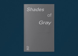
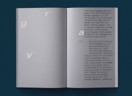
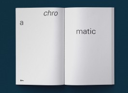
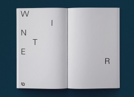
JUDGE THESE BOOKS BY THEIR COVERS
Art Direction, Writing, Print, Editorial, Book Design
What happens when you literally judge books by their covers and titles? As part of an assignment for Image class, I explored my interest in Text as Image.
With tongue in cheek humour, I made two books after E.L. James’s 50 Shades of Gray.
One book explores words associated with the word gray, while the other one is literally 50 shades in gray.
⧗ Year: 2014
Under guidance of: Michel Hoogervorst ● During time at: Royal Academy of Art, The HaguE
ARCHIVE
Identity, Print, Environmental Graphics, Curation
(1) PETRONAS Lubricants International. Identity / Print / Environmental Graphics, icw. Eric Cruz, Aaron Tan + team at Leo Burnett Kuala Lumpur, 2012. (2) GAB Foundation. Identity / Print / Environmental Graphics, icw. William Atyeo, Rupert Singleton + Aaron Tan, 2011/12. (3) District V. Identity / Print, icw. Aaron Tan, 2009. (4) Neue Format Design Mart. Identity / Curation / Design, icw. Aaron Tan + Wondermilk, 2008. (5) Kraftgrafik. Identity, icw. Aaron Tan, 2008.