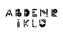
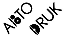
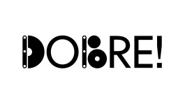
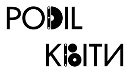
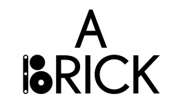
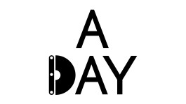
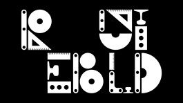
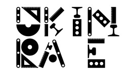
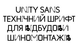
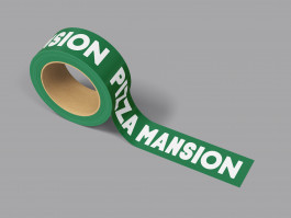
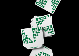
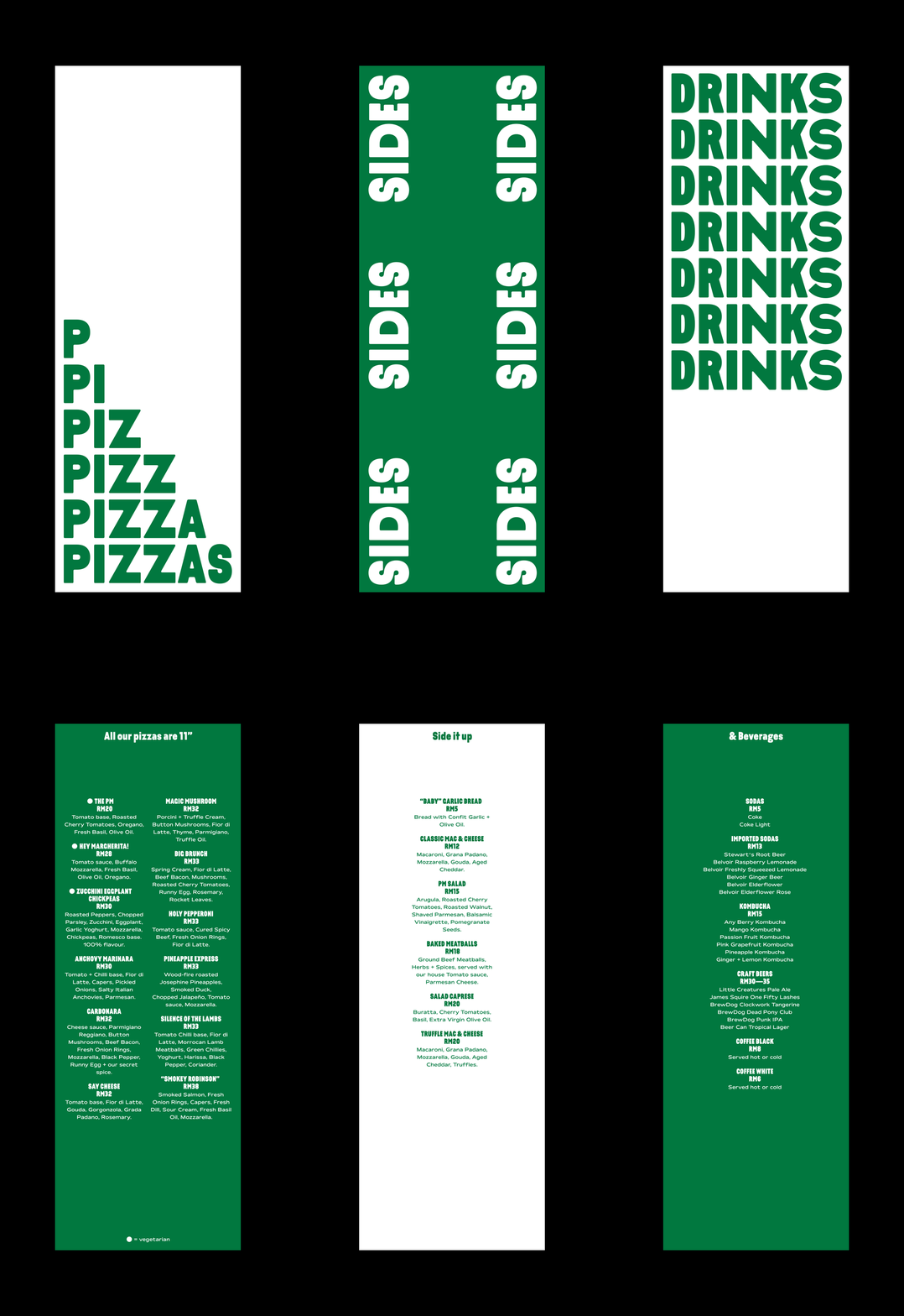
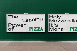
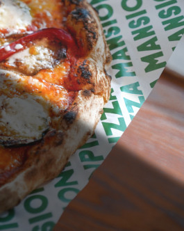
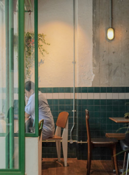
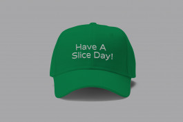
I crafted some typo-graphic visuals and illustrations featuring selected Grilli Type(faces).An identity for a pizzeria serving delicious wood-fired pizzas in Malaysia. The intentional mix of two typeface styles in the logotype gives rise (pun intended!) to the idea of dough being kneaded by hand.
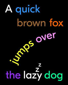
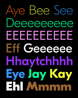
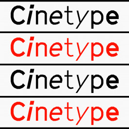
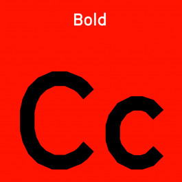
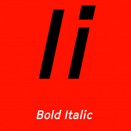
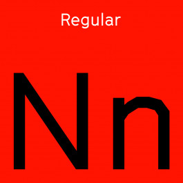
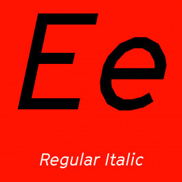
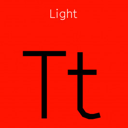
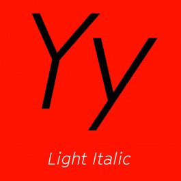
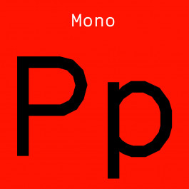
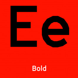
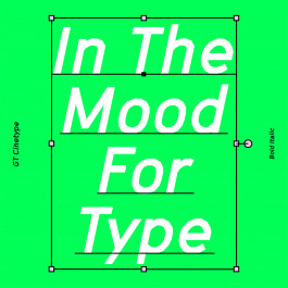

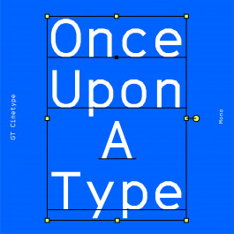
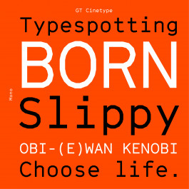
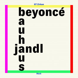
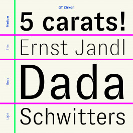
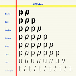

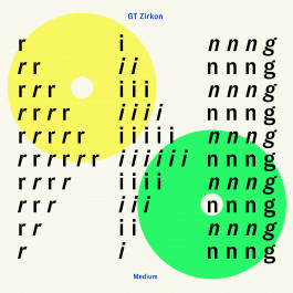
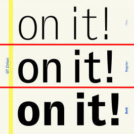
An identity for a pizzeria serving delicious wood-fired pizzas in Malaysia. The intentional mix of two typeface styles in the logotype gives rise (pun intended!) to the idea of dough being kneaded by hand.
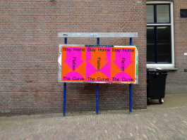
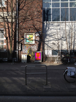
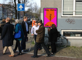
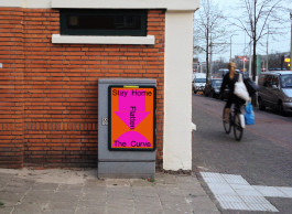
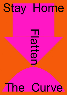
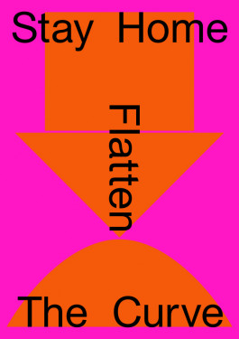
This poster is a 2021 edit of the poster I designed in 2020 during the start of the COVID-19 pandemic. The initial design was a contribution I made to the Stay Sane Stay Safe poster initiative.
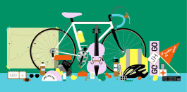
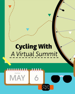
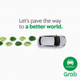
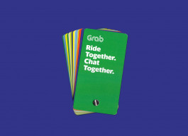
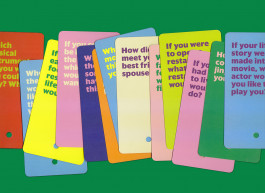
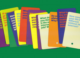
A small selection of work made during time at Grab, Southeast Asia’s ride-hailing super app. I worked on creative outputs for their marketing materials, while maintaining brand consistency in localised markets for Malaysia, Singapore, Vietnam, Indonesia and Thailand.





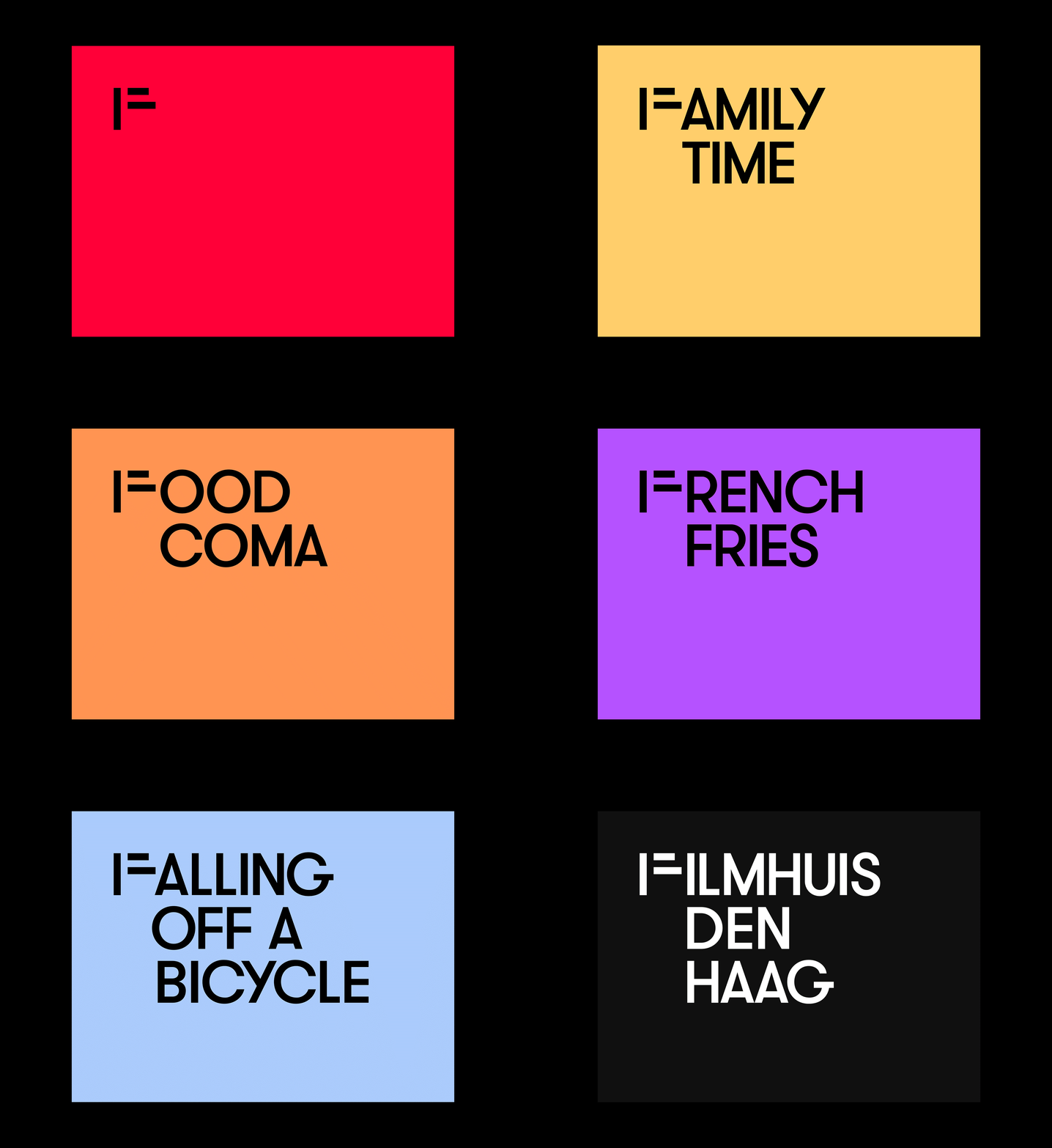
Filmhuis Den Haag sought a short animation for their screening intervals. The agency which designed their identity, worked with the second- and third-year graphic design department at KABK on a design pitch. I proposed a ‘typographic screenplay’ — which plays on the letter ‘F’ from the name Filmhuis Den Haag. The inspiration derives from the idea of life being cinematic, like a reel of film.
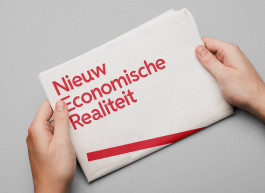
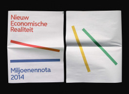
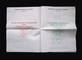
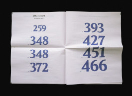
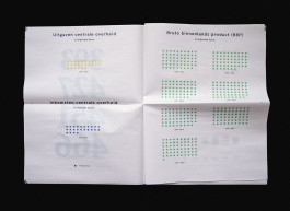
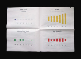
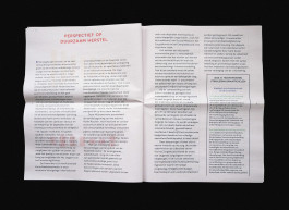
The third-year Graphic Design department at KABK was given special access to the financial data for proposed governmental spendings and income for 2014 (the annual Miljoenennota) by the Dutch Ministry of Finance. The task was to carry out extensive research and re-contextualise the information, statistics, and figures from the Miljoenennota. I attempted to create a new perspective on how data can be more transparent and visually engaging to the reader.
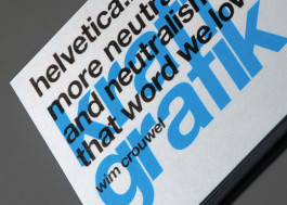
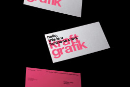
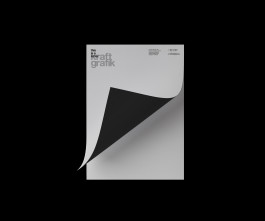
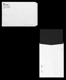
Kraftgrafik was a small design office I co-founded together with Aaron Tan in 2007/8. Its focus was on Brand Identities, Environmental Graphics, and Visual Communication. We wanted to showcase the craft of graphic design through our collaterals.