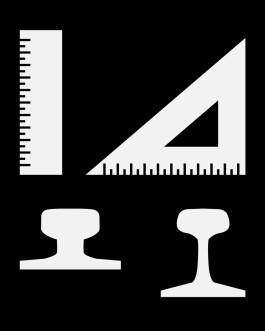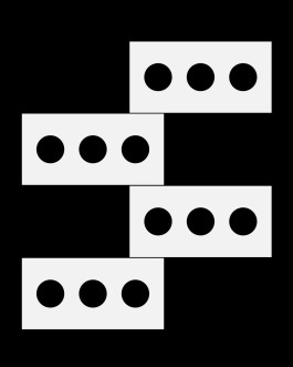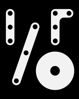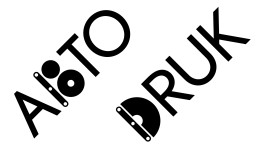
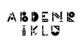
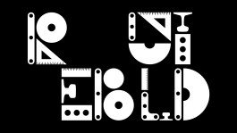
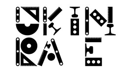
Seeing the theme is about rebuilding, I thought of designing letters in the form of graphic silhouettes of objects related to construction (Meccano plates, and building bricks,) measurement tools (rulers,) and transportation (railway track sections.)

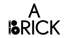
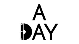
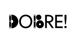
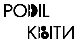
The letters D, and B (also works as V in Cyrillic) were selected for the final font. They appear in the “Display Max” version.

source: KTF


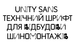
source: UnitySans.com