View as: Images Text
Re:introducing a coffee roaster with a simple, bold identity and packaging.
An animated concrete poem on facing adversity.
Churned out a fun identity for an artisanal handmade gelato shop.
Made some gr-illustrations :) and Grilli Ty[ographics] for a Swiss type foundry.
Designed a logo mark to celebrate 100 years of fluid technology.
Did some occasional typographic poster workouts.
Archive of selected work
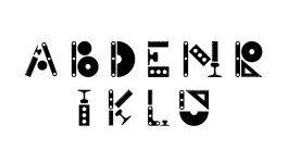
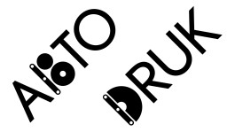
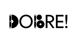
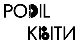
Unity Sans
graphic design
in collaboration with: Kyiv Type Foundry
year: 2023
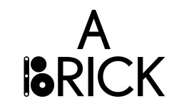
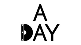
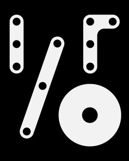
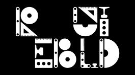
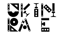
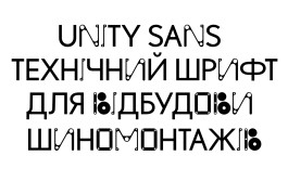
Unity Sans was created to support Ukraine in rebuilding its economy and fostering new businesses. Designed specifically for the “We Build Ukraine” project, this typeface serves as a symbolic contribution to the nation’s reconstruction efforts.


Hi! Melissa Chan is a human person/ graphic designer ☻
Working primarily on visual identities and typographic-led graphic communication.
Based in UA, by way of NL and MY.
Received her BDes from the Royal Academy of Art, The Hague in 2015.
Open to working together ↪ m[at]melissachan.nl
Connect ↪ linkedin, ig
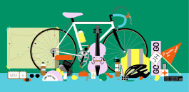
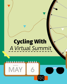
Cycling With
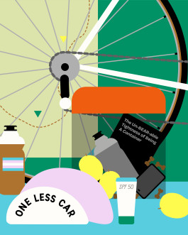
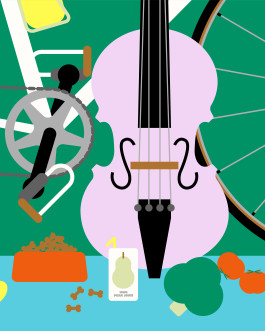
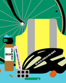
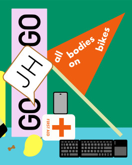
How do we present and fit all the topics of the summit celebrating women from all walks of life? Initially I illustrated the literal nouns with pictograms but it didn’t feel right. It wasn’t connecting with the story of the summit. I was stuck, and went back to the drawing board. How do I approach this from a fun angle?
Well, I love illustrating objects. The target audience are cyclists. Illustrating the essentials cyclist bring on them on the road suddenly made a lot of sense. CW added to the idea: How about including items related to each speakers?
illustration
in collaboration with: Annalisa van den Bergh
year: 2025
about
work
play
about